Wednesday 19 January 2011

PhotoEditing


This is how I picked out what image I wanted to change.

This shows how the highlight tool can change the image brightness around the main focus (the person).


This showing the basic cropping of the image, I didn't want to show too much skin in this image so I decided to crop it out.


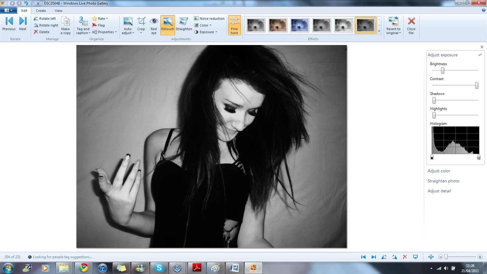
These images are showing me using the tools of cropping and the tools of colour of change and use of brightness, shadows, highlights and contrast.


 This screen shot shows me changing this image but using the tools that I could.


These next two images show cropping and changing the image to make it lighter before i make it black and white. 
  

Here I have changed the darkness of the the photo. This is so it looks like there is a glow around me and so my skin looks more even and healthier. 


I change the brightness on this so that my lips would look extremely red. Also so my skin looked more even I used the the blur tool and  I used the saturation tool to make my skin look more tanned.

 Once again I have changed this image to the colour look to make my model look more indie and to make her hair look darker I did this by changing the brightness i also used the blur tool around her lips.


 These two images are the same image but show how I have change the image from the original image to a new image. I changed the image by cropping  change the brightness, contrast, shawdows and highlights.

I wanted this image to stand out so I used the blur tool around the nose and eyes and made sure the eye shadow looked dark enough and that my hair looked dark and thick enough.


These three images show how the colour tool can change how the image looks.


This last image you can see im cropping so that my eyes are in the middle, so they are the main focus.

My music magazine


Photoshoot

Day and Time: 17th January 2011, 

Setting: My bedroom as I can have a different choice of backgrounds, it's a relaxed environment with lots of space to take picture. Also I can make my own lighting. 


Model: Myself and Mary Mcnamee. The main reasons I picked myself is because I know what I want and will be able to do it quick. I also asked Mary to let me take photos of her so I can add pictures to my content page. 


Costumes and Makeup: 


Me
Mary Mcname
LOOK
Make-up
Outfit
Make-up
Outfit
Floral Print.
Dark eyes
bronzer on cheeks
and light purple eyeshade
Floral print skirt and jumper
Slightly natural, big eyelashes an blue eyeshade
Floral print long top and jeans
American
Same as before but a light blue eyeshade
Baggy top and shorts with hair band
Sam make up as before but with more bronzer on the cheeks
Cropped top and jeans
Rock
More bronzer and black/sliver eyeshade
Tight fitting black leotard
n/a
n/a
Bed Time
Tone down on make-up
blush on the cheek, glitter eye shade.
Big baggy grey jumper and pink shorts
+ a teddy
n/a
n/a
Lace
Tone down make up
pringles 
n/a
n/a
White shirt
Red lips and dark eyes
5 microphones and a white cover 
n/a
n/a


Props: My bed, a teddy, a fan. I need the fan to get a wind swept look. Also the teddy is to connote that it is night time. Also Pringles as in one of the photos I want it too look like the classic duck pringles mouth. I need 5 microphones to wrap around myself to give off a rock'n'roll kind of look and also connote that I'm loads to do with music. 

Average time for makeup and costumes: 2 hour

Average time for photo shoot: 4 hour


Time plan

Planning

Task
Date Completed
Magazine Name and fonts
14th December
Colours for the front cover, contents page, and double page spread
14th December
Layouts of the front cover, contents page, and double page spread
19th January
Plan the photo-shoot
28th January


 Constructing
Do the photo-shoot
25th January
Edit the photos with Photoshop
25th January
Do an interview with the model for the double page spread
26th January
Make the Front cover
Make the contents page
Make the double page spread

Making the Magazine;

Name and Logo: 30 minutes
Time taken: 30 minutes

Layouts: 2 hours
Time taken: 

Drafts of magazine


 FRONT COVER. Here is three different types of layouts for the front cover of my magazine, I looked at music magazines already on sale to see what I could do. I like the middle layout as there not much writing on it, but being a new magazine I need more writing like the right layout as it need to attract consumers.  


CONTENT PAGE. I think for the content page I need to make sure it has enough information on it but not to much information that it too much for the reader. So I made sure that there is a few images. For example there a massive image on the left layout and there is enough room for the writing.                                                                        


DOUBLE PAGE SPREAD. I only did two layout for the double page spread. I made sure thats there a lot of images, as that attracts the consumers as you can tell on the top layout. As well I made sure there was one main image, to tell the reader who they are reading about. Also I like on the second layout how there is a main quote to how the reader what the article is mainly going to be about. 

Names for my magazine

From my research about music magazine it made me think of good names for my music magazine;
 - M
 - Crash
 - Trash
 - Tempa
 - Hitz
 - Genre
 - Ting!
 - system.
 - 1
 - N O . 1
 
They are just a couple of names that I like for a music magazine. Next I have taken three of the names that I liked the most and try out different fonts – also I have put a bit why I liked that name for the magazine and what it means.

Tempo. 


For music ‘Tempo’ is the speed at which a composition is to be played. For my magazine it could connote music, and what going on in music (how music moving along and whats happening in music now and what will happen later). My favourite font of ‘tempo’ is the fifth one day, as it look edgey and different. 


M.


As it just the letter ‘M’ this could connote a lot of different things first of all, M for Music, M for musicians, M for magic. Any word starting with ‘M’ you could think of. If it has the right colour scheme and right images and words, then hopefully people will think of Music. My favourite font for ‘M’ is the fifth one day as I think it needs to look bold, but not so it take the attention away from the main picture of the front cover.


Genre.


This shows that the music magazine isn’t aimed at one particular music genre, that it covers all the music genres. My favourite font for ‘genre’ is either the fifth one or the first one. They both stand out, but at the same time because of the look could appeal to different types of music fans. 

Deconstruction - Kerrang! Magazine.

Background information
Kerrang! First editor was Geoff Barton,  first published on the 7th June 1981. AC/DC were on the front cover. Kerrang! has had a few publishers starting off with, United Newspaprs who sold it EMAP (in 1991) then it got sold to Bauer Media Group (in 2008) who are now the current owner of Kerrang! magazine.
The current editor is Nichola Browne who has been then editor since 2008.
Kerrang! target audience is the alternative youth. This means people who are into brit mental, punk, rock, pop punk and emo instead of mainstream music. Between 2000-2003 there was a big sales drop what meant the huge genre at the time ‘nu mental’ had died down.  This is when Kerrang! started to feature more articles about new bands that teenagers where listening to and, Kerrang! is still doing that now on a weekly basis.
As Kerrang! has became more know it has done a-lot of cross-media convergence. It has its own radio station, merchandise, website, weekly products, a yearly awards night and a yearly Kerrang! tour which they get sponsored (synergy in business).


Front Cover.
The colour scheme is mainly white, black, and yellow. They will most likely keep the same colour scheme all the way though the magazine and on the content page.  You have the words ‘BRING ME THE HORIZON’ in yellow writing as well you have the words ‘win’ ‘access all areas’ ‘exclusive’ and ‘plus’ I think it is yellow to grab your attention as not many words on the front cover are yellow, its only one word, so this is to make you more aware of certain things on the page. As well they have put the title of the magazine in the background behind the band; this could connate that the band is more important than the magazine.
The main subject of the magazine is the band. You know this as they are the front cover, and the title of the band is eye-catching and, the picture of the band is a medium shot, so you can see most of the band - this is used to anchor people in. As well having the picture of the band, fans will be able to recognise the band.
This is a very busy front cover, as it has a lot telling you what articles will be featuring inside the magazine. Also to anchor people into buying the magazine they have put the words ‘win’ and ‘plus’.
At the top of the magazine it says ‘WIN’ this is good advertisement for Kerrang! as this will create a way of making money for the magazine at the same time anchoring new people to buy the magazine as they might want to enter this competition.
At the bottom of the magazine it gives an overview of what else is going to be in the magazine.
Also on the front cover there is a small picture of another story in the magazine, the picture is not covering the main band faces. Also there are subtitles which show what are including in the magazine and will give the every week buyers an insight what’s going to be in the magazine.

 
Content Page.
On this page the colour scheme has carried on; black, white and yellow. The title of this page, the issues and date it was released is following the same font as the front cover.  The content gives one main picture (medium shot) and two pictures next to it, showing some of the double page spread they have done.  Also they have put on the right of the picture what page it is on, so the reader can go straight to what they want.
The bottom half of the page tells us what is in the magazine this week. Below there are the page number and what is on that page. The magazine all contains bands, competitions and the ‘regulars’. 
The main outlines of the magazine are;
Feedback
News
Swag (competitions and prizes)
Live Reviews
Features
Album Reviews
Gig guide
K quiz.

Also on the page there is a picture of the editor and a short paragraph or two about the staff at Kerrang! magazine and about upcoming events related to Kerrang! magazine. Also at the bottom of the magazine is offers to get a membership to the magazine which could be delivered to your house, which could be beneficial to the reader, also saying its ‘£6*’ for an every week reader could be cheaper for them, making this part of the magazine appeal to them.


Double page spread. 
 The first thing you see is ‘were being the best mcr we can be!’ which is similar font to the front cover to make it relate all the way throughout the magazine. The writing is at a canted angle to connate that it’s been put on there as a quote. The whole double page spread has been used as a white, red and black colour scheme. 

At the top in the corner is a small note saying they can go on the website for more information and stories about mcr and other artists. 
The main picture on the page takes roughly one page, they have manipulate image, and it is a shot of one of the band members singing, the image colour has been change to give the image more depth. It also gives the reader an idea on who they will be reading about, or if they are fan they can see the band and want to read. 
There are three other pictures added to the double page spread. They are added sometimes because one image isn’t strong, so adding more images gives the reader a better idea on what they are reading about. These images have also been edited like the main picture on the double page spread to show that they a linked together. 
In the middle of the page is the main article and it is written in white to make it easier to read and to make it stand out more against the black background. On this double page spread there is not much writing compared to other double page spreads but the magazine must of felt that the picture meant more than the words. 
On the right hand side is a list of new songs that this band has been working on.  It’s done on a white background and black writing this is to make it stand out more, as it might look obsolete next to the picture and the article. 

Deconstruction - Q Magazine.


Background Information. 
Q magazine was founded by David Hepworth and Mark Ellen and was first published in October 1986. The magazine was first called 'cue' but the name was changed so that it wouldn't be mistaken for a snooker magazine. At the moment Bauer Media Group owns Q magazine, but it also owns other popular music magazines like Kerrang! and mojo magazine. In June 2008 Q launch its own full serviced radio station, Coldplay were involved in the launch of the station by giving an interview, on the day of the launch. As well as a radio station Q has a television channel called 'Q TV' and hold annual awards ceremony called 'Q Awards'.  
Q magazine is an indie-based magazine, but does have a broad scope of genres. Most of the magazine has interviews with popular or upcoming musical artist. Also Q started the 'spine line'. In every issues of Q, it has a different message down the spine, reader then have to try and work out what the message has to do with the magazine. 
The current editors is Paul Rees, who was the former editor of Kerrang! (UK edition) 

Front Cover
The title of the magazine ‘Q’ is in a red square background so it stands out, and Q is a very well known magazine. A part of the ‘Q’ is covered up by the band on the front cover, what could connotes that the band is more important than the magazine or it could connotes that because that the magazine is so well know, that they don’t need show it because people will recognise it.

The band on the cover, is Take That and the words ‘Take That’ is the largest piece of text on the front cover which denotes that the main story in the magazine is about Take That. Above the words ‘Take That’ is says ‘The World Exclusive’ when you see that is makes you intriguing whether you’re a fan of Take That or not. All the members of the band on the front cover, are all wearing the same sort of outfit this connotes that they are all together again adn they are all equal to each other. They all seem really happy, and laughing, to show that they are having to a good time and that they all like each other and they are happy to be a band together.
On the front cover they have the words ‘Q awards 2010’ and ‘Green day’ in gold to show that they are special, and when people see the colour gold, they think expensive, special and important. This could mean that the band green day could be involved in the awards.
They haven’t used lots of colours of colours to get people intention; they’ve used a very minimal colour scheme only using four bold colours; black, red, white and gold. This makes the magazine stand out more, as it not got a lot going on, and what is on the front cover, stands out. It’s a very simple look, so it won’t intimidate people and it won’t look too complicated.


Content Page
The content page and the front page are very similar. This is mainly because of the colour scheme is the same and they have used same picture on the front cover but at a different angle. As well they put the number ‘48’ on the picture denotes that on page 48 it’s the article about Take That.
There are a lot of pictures on the content page which makes it more appealing and shows the audience clearly what page are the main stories are, and who they are about. By using pictures and large page numbers, it makes it clear and quick process for the reader to find what they want.
The photographs are all professional, and set up in a controlled photo shoot, rather the seeing a paparazzi shots that you would find in the less high-end magazine.
The other stories and interviews and regular stories in the magazine are laid out systematically and visibly.

Double-Page Spread.
One side of the double is a medium close up of Rihanna. This is too show that this interview is with her and about her. The main colour in the photograph is black, she has a black background and her clothes are black which makes her lips, hair and megaphone stand out. The black colour scheme in the photo makes the photograph a sense of mystery and her expression on her face makes her seem fierce. This connotes what her music is like, and what the article is focused on, and what could/is expect from her music.
The article colour scheme is very plain, and bold; what makes the article more clean cut and easier to read. The questions are in a bold font, which is useful  if you are looking for her response on a particular subject then you could find it quick without reading the whole article. The heading for the title, is in capital letters, and is short and simple; and it tells you what this article is going to be about ‘RIHANNA’.