Wednesday 1 December 2010

Questions

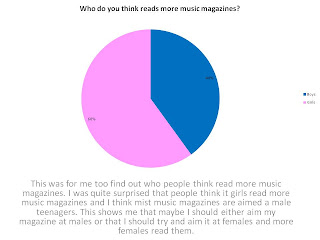
The first question I asked was about what gender you are, and how old you are. I asked 15 people in total, 7 girls and 8 boys. I also asked a range of ages from 6 to 26.
I got five pictures of music magazines front covers and asked which one of these are the best and which one of these look the most attractive, most people found rolling stones and Q the best and most attractive, This says to me that most people like girls on the front cover of their magazines. Also most people say that country music wasn’t the worst and least attractive magazine, it might be because they don’t like country music or, it just not that popular.  This tells me that maybe I should aim my magazine more at the mainstream music, as that what most people thought was the best and most attractive.
Next I asked what people favourite music genre is and who their favourite singer/band is at the moment. The most common answer was Indie, then it was rock, acoustic, then it was, dupstep, R&B, Rap/Hip-Hop and pop. As well people did give more than one answer. For favourite singer/band people gave a variety of answers as everyone had a different taste and different answers to this question. 
The price ranges are £2 to £10. Two people said £10 and one person said £2. Four people said £3 and three people said £4.
I found out that in a magazine people don’t really want a lot of advertising.

On the font cover of a magazine about 87% of the people I asked wanted someone famous on it and, only 13% people wanted a snapshot from their latest video.
Also I found out that out of the people I asked about 60% of them would prefer a monthly magazine and 40% would prefer a weekly magazine. This makes me think that I should make a monthly magazine


Preliminary Task

I chose the name Speechless because it connotes amazed, wordless and astonished to its audience. Also in the same font of the magazine title i have put ‘Cathy White’ in the same font as it shows that will be my main story. This Magazine I decided to make it target audience for sixth former at Guilsborough School. I took a picture of Cathy white and edit it by blur the image, crop the image, I brought the eyes into more focus, the camera shot was mid-close up with a mid-angle. I also add three pictures at the bottom of the magazine to show my readers what else is in the magazine. The first picture it says ‘Knowing YOUR limits’ this connotes about knowng your alcohol limits, and the picture goes with the title as you can see he passed out from alcohol, the picture you can see has a boy passed out and has had a alcohol bottle, cards and crisps packets placed on him. The Middle picture has Charlie Davies texting someone so I thought this image will go well with ‘Can texting cause brain damage?’. The third picture is Chris Day saying ‘Catch the symptoms early!!!’ this can connotation anything. I haven’t placed a price on the front cover as I think it would be better to put it on the back of the magazine. For my Colour scheme i have chosen white, grey and black, and the black and white stand out, and the grey goes well with both colours. I would have this printed at A4 size because the majority of magazines for that sort of age group are A4 and I don't want the target audience to feel that because it's a small magazine it doesn't have as much information in it.


 In my content page I have use to the same font as the front cover to say ‘Content page’ to show that they relate to each other. The content page is everything that is included in the magazine. I still use the colour scheme of black, white and grey to keep it consistent throughout the magazine. All six pictures on the content page I took and edited myself, I wanted picture that would most relate to sixth formers at Guilsborough school. I’ve also put in a editor letter because on most content pages in magazines there is an editors letter. In the editors letter I’ve put in what is going on this week at school and what I think about the double page spread in the story.