In what ways does your media product use, develop or challenge forms and conventions of real media products?
I started by deconstructing the covers of variety of music magazine with all different types of genres and different target audiences. This showed me lots of different types of layouts for magazines and techniques to attract certain social groups and what features could features are best suited for a new music magazine. Both the magazine I deconstructed, I noticed that their names were partly hidden, this is because they are well known music magazine covers therefore people don’t really need to see the whole name in order to know what magazine they are reading. Because my magazine is a new magazine I decided to have my name in front of the image and to have it big and bold.
My music magazine uses different layouts from existing music magazine is the layout of my content page, I used some text overlaps some of the images and decorations. This is to make the page look more interesting and draws the reader in. The variety of different sizes of fonts is very similar to the content page of ‘Kerrang!’
The double-page spread consists of texts in columns, this is used a lot with newspapers and magazines to create the impressions that there is not as much a read and it also helps the reader to read the article a lot easier. This has been used with the double spread in ‘Q’
I used shapes to decorate the page such as grey lines and a black banner which runs across the first page. I got this idea from ‘Q’. On the double page spread I used a series of pictures put together to give the reader something more interesting images to look at, I got this idea from reading the magazine ‘rolling stones’
Lastly the layout I used the interview layout from ‘Q’ to do my magazine. This is the question being above the answer. This makes it easier for the reader to understand who is who.
Lastly the layout I used the interview layout from ‘Q’ to do my magazine. This is the question being above the answer. This makes it easier for the reader to understand who is who.
How does your media product represent particular social groups?
My magazine is targeted towards teenagers and young adults. I chosen myself to be the model and portrayed myself as some new and upcoming singer, who doesn’t have much cares. The double page spread is mainly about her new life and about her getting bad press, and bits about her. Many teenagers can relate to this, as the is a stereotypes of teenagers not caring about anything and doing whatever they feel like. My model is represented as a girl who doesn’t care that much, doesn’t want to be a role model and just wants to have fun in life this will further persuade other teenagers to buy the magazine or aspire them to be the same.
What kinds of media institution might distribute your media product and why?
The publishing company I would use for my magazine is Bauer media.
Bauer media is a leading media institution which operates in 15 countries and publishes other music magazines such as Kerrang!, Mojo and Q which has a similar target audience to my music magazine.
Worldwide circulation of Bauer Media Goup’s magazine titles amounts to 38 million magazines a week. Also as is it’s a well known publisher; it would be really easier and cheaper to get companies to advertise in my magazine. I think it’s would be the best thing for my magazine to be published by this company.
Worldwide circulation of Bauer Media Goup’s magazine titles amounts to 38 million magazines a week. Also as is it’s a well known publisher; it would be really easier and cheaper to get companies to advertise in my magazine. I think it’s would be the best thing for my magazine to be published by this company.
I would distribute my copies of ‘Tempo’ by putting them in popular retail places such as Tesco’s, WHSmiths and other popular newsagents and other big supermarkets. I would also sell the magazine online and do subscription deals for he magazine to be sent to the reader every month.
Who would be the audience for your media product?
The target audience for my magazine will be people who are very up to date with the new songs and albums and will have a passion for music. The age group my magazine is aimed towards the ages between 16-25. This is because my magazine is based around new music in the charts, upcoming artist and gigs, which may not appeal to older generations. As well because it will have a lot of text in it, it might put of teenagers younger than 16. Also the type of language and references might be unsuitable for people younger and parents might not agree with it. The gender of the audience will be both males and females aged between 16 – 25 , as a mix of genre’s and artist will be in each issue.
I asked my target audience what they thought of my magazine and this is what they said, I asked them on Facebook, Twitter and face to face so I can get as many as response as possible.
‘All the pictures go well together; I like how they are black and white.’
‘The colours are really bold and go well together.’
‘I like how you have edited it!’
‘The double page spread could have been more colourful, all the picture are black and whie, some could have had colour’
‘Good use of colour scheme!’
‘I like how you have just used a splash of red in the double page spread.’
‘I think the images and text go good together on the content page.’
‘Good layout, and colour scheme.’
How did you attract/address your audience?
To attract my target audience I tried to find a model who was in the same age group as my target audience.
The double-page spread I went for the stereotype of teenagers. This is the stereotype that teenagers don’t really care and I chose to base the story around the artist not really caring about things and just having fun. This addresses them as it is easy for them to understand.
Another way I attracted my audience was trying to chose suitable colours. I felt that the bright and bold colours I chose would make my magazine more appealing and draw consumers towards my magazine. You can see I used this on the front cover as I put the words ‘Tempo’
What have you learnt about technologies from the process of constructing this product?
I had always used Photoshop, and I liked editing some picture, but never went into so much detail before. While changing and contructing the image I learnt different skills and techniques so I could improve the original photo.
The first example of this, was the blur tool. I learnt how to use the tool so I could improve the skin, make it look clearer, smoothers and less dirty. So if there was make up I wanted to get rid I could almost do that. This type of editing and detail made the photo look more professional. I used this tool a lot of the double page spread images as they were straight on the face and black and white so the detail was everything. So I blurred the skin around the eyes and nose. On the front cover I smoothed the lips to make the red seem more red.
The first example of this, was the blur tool. I learnt how to use the tool so I could improve the skin, make it look clearer, smoothers and less dirty. So if there was make up I wanted to get rid I could almost do that. This type of editing and detail made the photo look more professional. I used this tool a lot of the double page spread images as they were straight on the face and black and white so the detail was everything. So I blurred the skin around the eyes and nose. On the front cover I smoothed the lips to make the red seem more red.
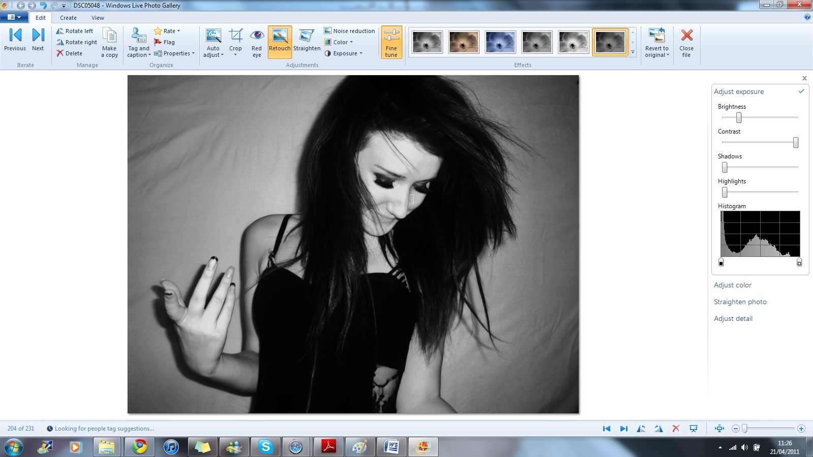
I learned how to crop pictures effectively without taking too much off and not keeping on. Also I learnt how to change the colour of the picture, from changing the brightness, saturation, shadows, contrast, highlights tint and colour temperature. All these dials and tools helped me change the image so that the skin looked more tanned or to change the image to a certain type of black and white image.
A program I had learned to use is publisher. I used this programme because I found it easy to construct my magazine. Also personally I think it’s one of the easy and best programmes to use that I can get a hold of.
Lastly, I had never used a blog before let alone blogger so when I first got told that I had to use blogger I was too happy about it. As you could tell I even had difficultly get the web address right. At first I found it very complicated to use and very annoying as it didn’t want to work sometimes. After a while I started to understand blogger better and found it a bit easier to use.
Looking back at your preliminary task, what do you feel you have learnt in the progression from it to the full product?
As you could tell, I lacked knowledge about music magazines and had to study more on music magazines and buy different types of magazines then what I normally got. As you can tell from my first preliminary task and the magazine cover now that hopefully a lot has changed and its more constructed. I also used a much better image for my final piece. I think this because my Photoshop skills where better and my images that I took where a lot better than the preliminary ones.
I have also learnt how to make my work look and present my work neater then before. This skill I had to pick up to attract my target audience. Also I think that my thought process is more detailed and a lot more thought than at the beginning, for example I didn’t care to much about the colour scheme for the preliminary task and didn’t give it much thought but for the main task I thought about it more, and thought about what the colours meant and how it could attract consumers.


